Wednesday, 9 June 2010

Thursday, 20 May 2010


Here are some images i took from the millennium point exhibition. These images relate to my actual project due to being about fingerprints.
Within the fingerprints they show arches, loops and twirls

Tuesday, 18 May 2010


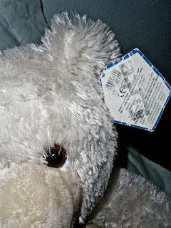
This would be about my little cousin (Ethan) he is 2 years old and loves his teddy bears and the one word i can only think of to describe him is cute.

The outcome didn't come out as i wanted to because the material i printed it on was too shiny so didnt print very well. I can understand what it say personally but i don't know whether the viewer would be able to.. i may have to do this photo again ...


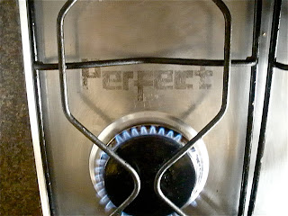
These photos would be about my mother. She is perfect to me so this is why i used the world perfect and the first place i fought of her being would be in the kitchen. Sounds bad but yeah, with this type i did it on a iron and also the kitchen stove because i couldnt decided which on looked better, i might use both though why not aye?


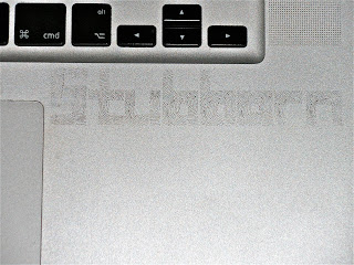
This one was about my cousin (Jacob) he is very stubborn he always has ti have things his own way so this is why i chose this word. I printed the type onto a mac because he is also a computer geek. He is always on the computer and uses it as a career.
I could'nt decide which one to chose out these 4 so i will have to decide last minute but i prefer the last image because it is more clearer than the others to read.

These photo's relate to my cousin (Jamal) all he ever talks about it and play is football so this was the first image which came to my head. I chose the word rude because he is. It was the only word i could find perfect to describe him. =]


These photos relate to my cousin (porsha) word creative was the first word which came to my mind to describe her and also the vision of playing the wii machine did also so i printed the word onto the wii machine.

I edited it too make it black and white so it look more effective i like the outcome of this cause there's alot of tonal elements within.
I took a few photos of this but picked out 2 which i liked the best but i am going to use the top image in my book because the type is more easy to read


These are 2 photos i took bout my brother, the word focus i used because he is always focusing on his work or other stuff and i also chose the objects cards because this was the first fought which came to my mind, he loves to play poker online and at casino's. (and he gives me life stories about how much money he wins).

I could'nt decide which one to use because u like them both but i think i perfer the top image more.

It was hard to print my typeface onto cards because the material of the card is shiny so it did not print on as well as i hoped but i still like the outcome because it is still readable.

This is an edited version of a image i took for a page in my book. I prefer this one compared to the other previous photo because the type is clearer and i also like the effect. I will be using this as a page in my book.
I have started my whole photography typeface imagery again because i wanted more narrative to my outcomes. The prevoius images i took the locations i took them just related to the word.. What i am doing now is making a word which describes a family member and placing the word in a location or on a object which also describes them to me.


This image would represent my father. I chose the word protective because my dad is very protective over me..
Your probably wondering why i printed my font onto a cd?
This is because the first thought which came to my mind relating to my dad was music, since he loves it and is always playing it so i decided go print my type onto a cd and place it on his dj set.

Friday, 14 May 2010


This is a table i have created on Microsoft word. It simply is just a table which shows family relation, names and 1 word which first came to my head when thinking what word would describe them. For each person they are going to have a page within my book which i am going to make this is basically a plan of the previous photos i took below.

You may be wondering why my uncle delroy there is a ?.. this is because he died in a lake in Sutton park and there was no reason for his death which is a mystery. So i fought a ? would be suitable for this.


Here are some photo is have taken using my camera to use in my font book i am going to create. Here are 4 of the 20 i am going to take, i am taking them in different locations around my house and printing words which describe members of my family too me.

Example: Perfect - Mother - Candles behind the word showing warmth and welcoming.

I first experimented with the word perfect by printing the word onto a glass window but the background did not suit the word i was trying to show and fought the word protective (my dad) would be more suitable for this due to a almost dark side and serious.

The word rude was just for experimenting.. i would use the word rude for a different background but i wanted to see how it would look with object overlaying the time and surrounding it.

I will be taking many more images ..

Thursday, 13 May 2010


Here is my typeface i have created again.. i created it again because on the previous one i used a accidently used a fingerprint which had been pixelised instead of using my original vector version. Also with this type it includes a-z, A-Z 1-9 and also puncuation

It needs abit cleaning up but this is the general idea of what my type will look like

Here i was just researching typeface book layouts really, i couldnt really find much but i came across this one by William Caslon.. personally i think the layout he has done is too much simular to being a newspaper its too formal for me but then again its research!


More illustration i found.. I like the 1st image above how they have used a fingerprint to create a woman wearing a dress as if that is the pattern.
And the illustration below it i like because i like the layout of how all these shapes can create and building view image .. this one doesnt really have no relivence to my fingerprint designs but i like it :D


More fingerprint illustration.
The last 3 illustrations i have found i find really techno as in futuristic due to the colour schemes and shapes and lines used to create this effect. This has made me think whether in my design should i make it more futuristic?


here are some illustrations i researched for abit of influence for my poster design or even my book page covers. this is relevant to my actual finger print design due to it also including fingerprints within the illustration. With in both images they both show different ways fingerprints can be used..

Saturday, 24 April 2010


Here i went to Custard Factory and found an illustration artist called ... . I have uploaded some of this work for influence and primary research. I like the typeface he was created, it looks very neat yet also messy. Within his design theres alot of columbs used to created shape and for the type to be clear.